

Published by Sign Guru
Start with distance, not with design
The first question is not what the sign should look like — it is how far away your customer is when they decide. Someone on the opposite pavement, someone in a car at 40km/h and someone walking directly past are three different design briefs.
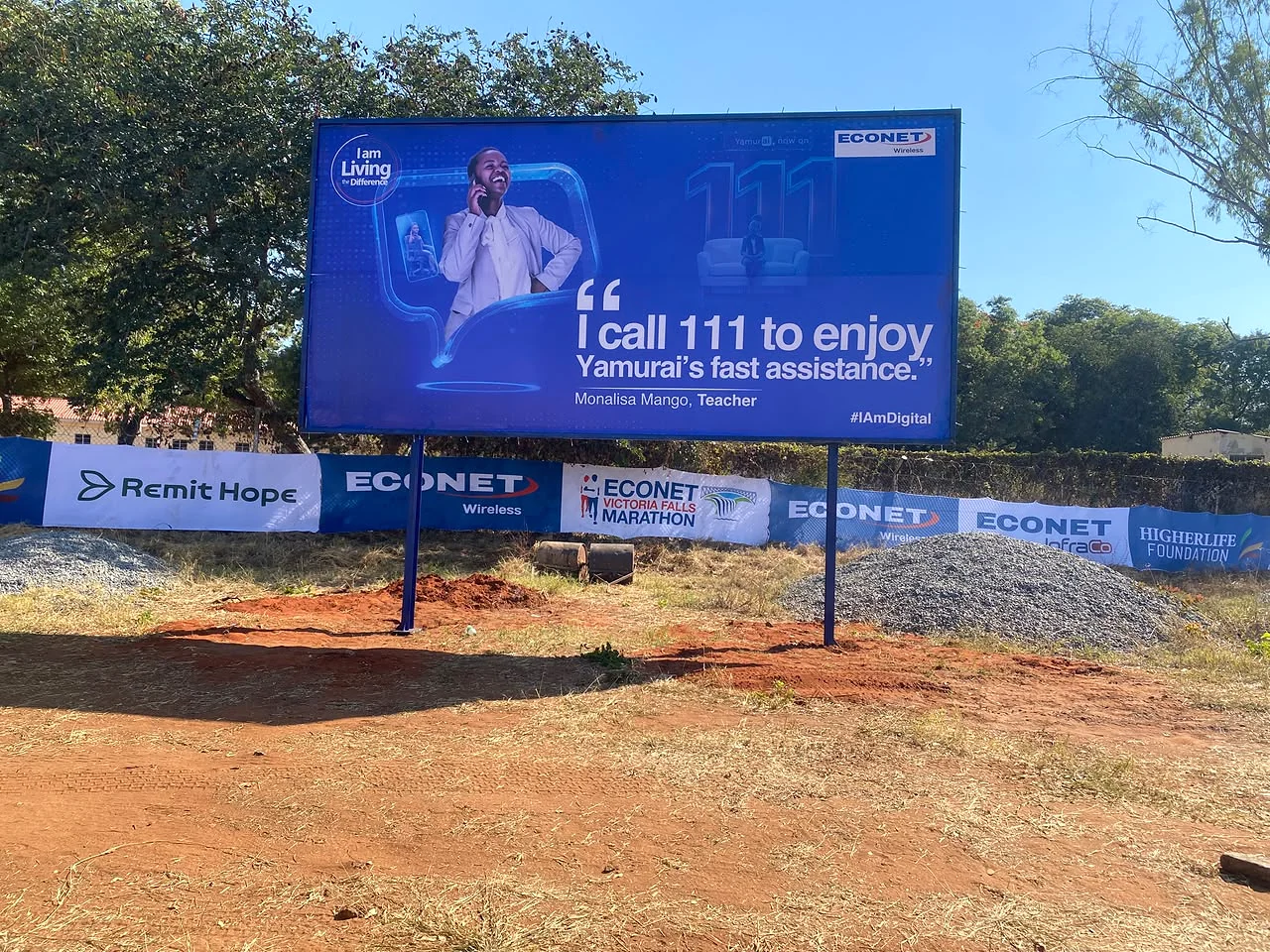
As a working rule, the further the viewer and the faster they move, the larger the letters and the fewer the words.
Contrast beats colour
Legibility depends far more on the contrast between the letters and their background than on the colours themselves. Dark type on a light field, or light type on a dark field, will always outperform two mid-tone colours of similar brightness — however well they match your brand palette.
Use the window as a second layer
The fascia says who you are. The window says why to come in: your main categories, the current offer, opening hours and payment methods. One-way vision film lets you use the full glass area for a message while keeping a clear view from inside.
Keep a clear sightline into the shop at eye level. A fully covered window reads as closed.
Common mistakes
- Letters sized to fill the available panel rather than sized for the viewing distance.
- Listing every service instead of one clear category line.
- No illumination on a shop that trades into the evening.
- Faded, peeling or outdated promotional graphics left up for months.
- A phone number too small to read from where anyone actually stands.